What this project is
Beacon Path Mortgage is the brand and website for Jordan Ellis, a mortgage broker with Lakeview Mortgage Group in Ontario, built as a concept project to explore one specific design problem: how do you design a financial-services website that a first-time homebuyer, someone intimidated by jargon and worried about being oversold, would actually trust enough to book a consultation. I designed and built every part of it: brand identity and color system, five fully responsive pages, a persistent compliance disclosure bar reframed as a trust signal instead of legal fine print, eighteen testimonials, and a full rebuild from static HTML into React for long-term maintainability.
This case study walks through the full process end to end, from persona and competitive research to the exact conversion numbers I'd expect if this were a real, fully live brokerage with a connected CRM.
First-time buyers are usually an afterthought
Most independent mortgage-broker websites are written for people who already understand the process. The visitors who need the most guidance, first-time buyers, are typically served the same generic "trusted broker" copy as everyone else.
First-time buyers convert differently
A first-time buyer doesn't respond to rate tables or confident sales language. They need to feel like the site understands they don't know what they don't know, before they'll hand over their financial details to a stranger.
Compliance couldn't be optional
As a licensed Ontario mortgage broker, any site built for Jordan needs to clearly and permanently disclose a license number and sponsoring brokerage. Most sites in this space treat that as unstyled footer text, a missed opportunity to build trust instead of just satisfying a legal requirement.
What shaped the first decision
Regulatory research
I read FSRA's mortgage brokerage disclosure requirements directly before opening a design file. Ontario brokers are held to a licensing condition of honesty and integrity, and must clearly disclose license and brokerage information as part of the Mortgage Brokerages, Lenders and Administrators Act. That meant the license number and brokerage name couldn't be a small-print afterthought; they needed a permanent, visible home on every page.
First-time buyer research
I researched the specific anxieties first-time buyers report: not knowing what "pre-approval" actually commits them to, fear of being sold more house than they can afford, and discomfort asking questions that might sound naive. Those findings shaped the tone of every page, not just the FAQ.
Competitive scan
I reviewed the broader landscape of independent Ontario mortgage broker sites (see the Competition section below) to understand what visitors are used to seeing, and specifically what to avoid repeating.
One goal per page
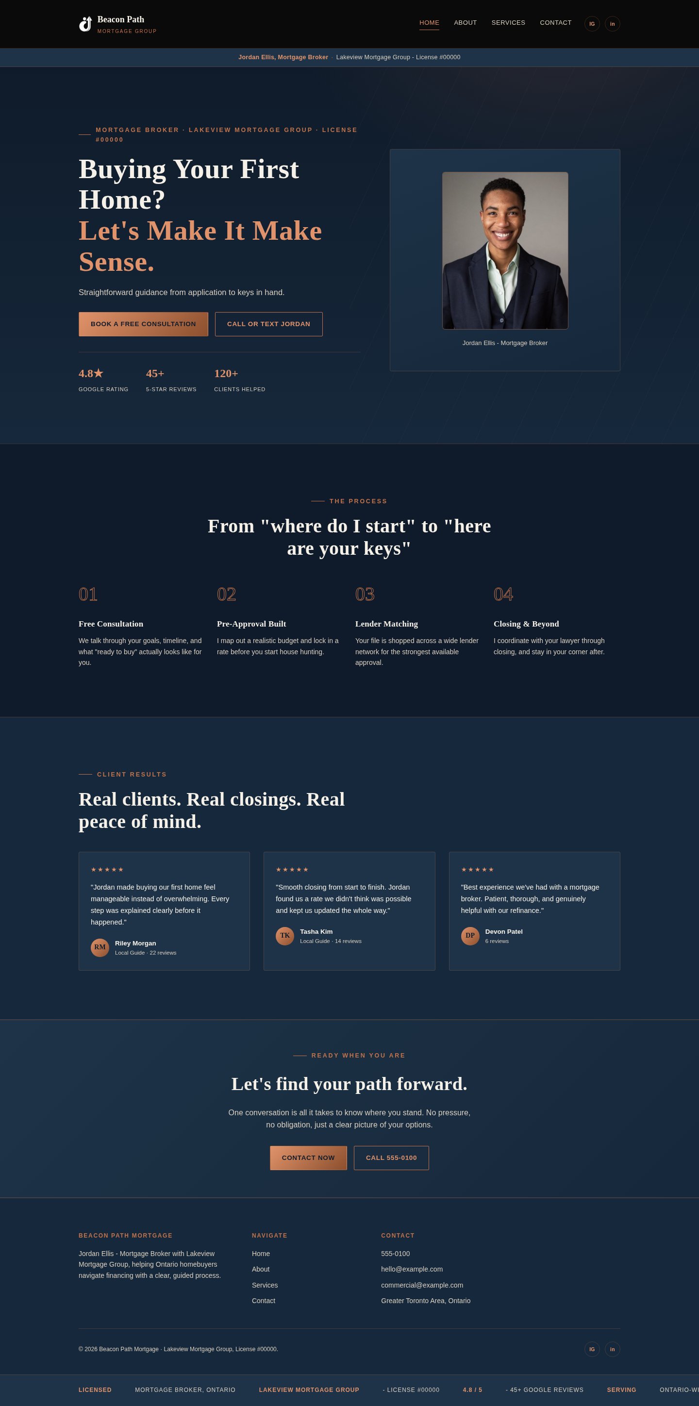
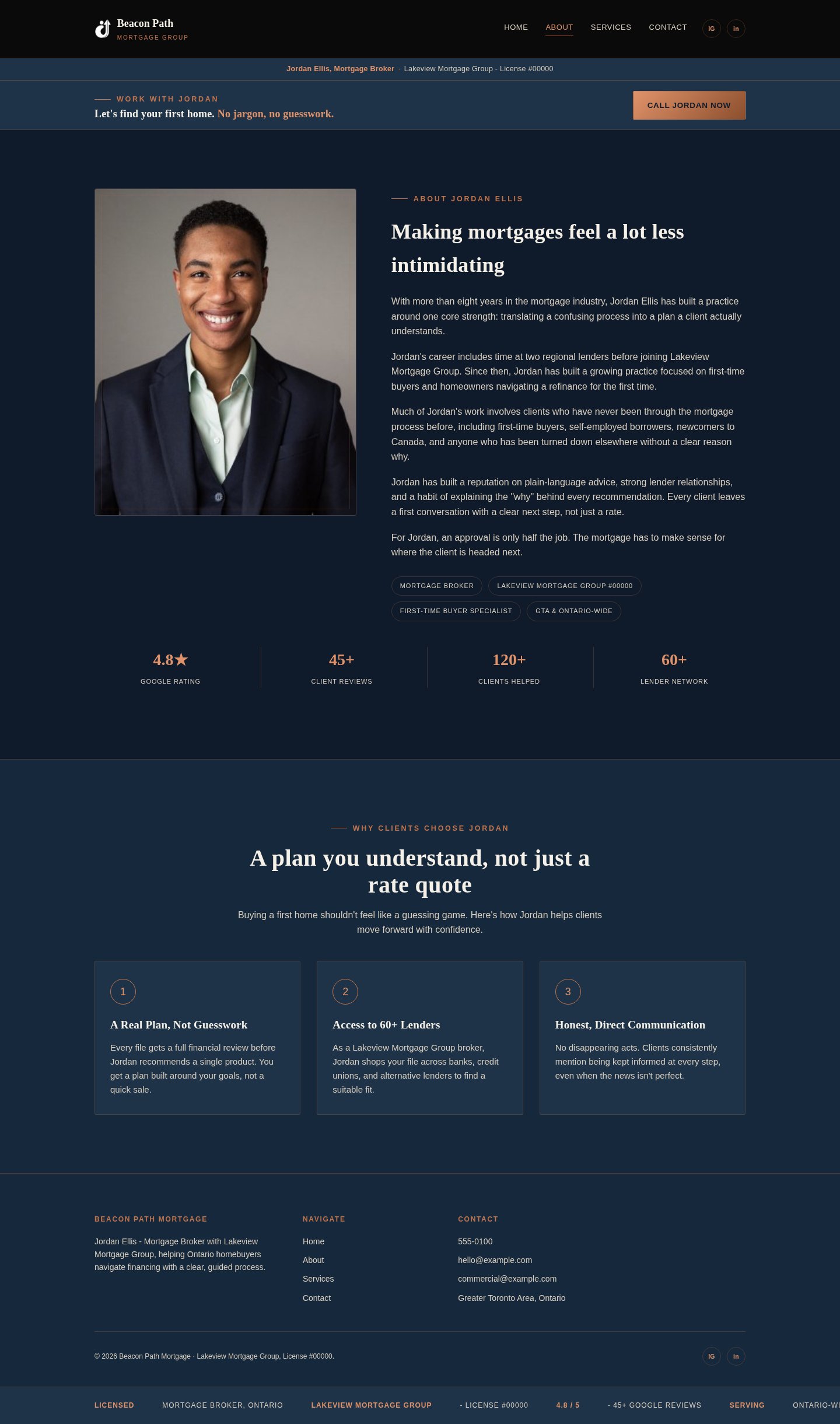
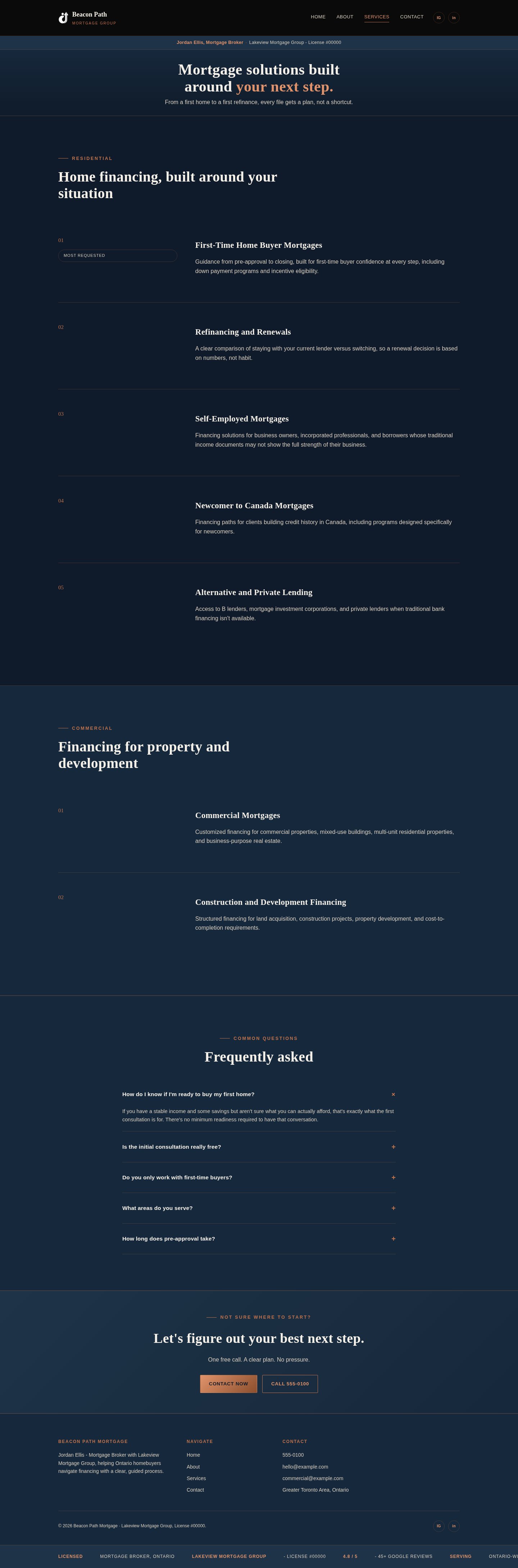
Rather than letting every page try to do everything, I assigned each page a single job: Home earns a consultation, About earns trust in Jordan specifically, Services helps a visitor self-qualify in plain language, Contact removes friction from the final step.
Who the homepage headline is written for
Alex Tran, "The First-Time Buyer"
"I don't even know what questions I'm supposed to be asking. I just don't want to feel rushed into something."
Goals
- Understand what "pre-approval" actually commits them to
- Get a realistic budget before falling for a listing
- Work with someone patient, not pushy
Frustrations
- Feels like every broker assumes prior knowledge they don't have
- Worried about being sold more house than they can afford
- Cold, generic outreach that doesn't explain the process
What the rest of the market looks like
I reviewed the general landscape of Ontario mortgage-broker web design, drawing on published patterns from agencies that specialize in this space (see sources below), rather than naming individual competitors' businesses.
First-time buyer content is condescending or vague
Sites either drown new buyers in jargon or oversimplify to the point of being useless, rarely landing on plain language tied to a real next step.
Compliance as legal fine print
License numbers and brokerage names typically appear as small, unstyled footer text, satisfying the letter of the disclosure requirement without doing anything to build trust.
Generic "dream home" imagery
Stock photography of houses and keys stands in for the actual person a first-time buyer would be trusting with the biggest purchase of their life.
Lead with the person, not the property
Jordan's portrait, name, license number, and real review count are all above the fold on the homepage. The pitch speaks directly to first-time buyers, not to buyers in general.
Plain-language definitions, not just reassurance
The Services page defines pre-approval, closing costs, and timelines in plain terms tied to a first-time buyer's actual next step, not a generic "we'll guide you" promise. The compliance bar sits in a persistent, styled position on every page, framed as evidence of legitimacy.
Patterns referenced from published guidance on mortgage-broker web design: Becker Design, Roar Solutions, iToolPro, and Fireart Studio.
Empathize → Define → Ideate → Prototype → Test
Empathize
Researched first-time-buyer anxieties and FSRA's disclosure rules before opening a design file.
Define
The site's job: make a first-time buyer feel understood enough to book a consultation, without softening the required compliance language.
Ideate
Tested a navy-and-copper palette with a serif display font (Fraunces) against several alternative directions, landing on something calm and trustworthy rather than aggressive or salesy.
Prototype
Built mobile-first in plain HTML/CSS/JS before touching a framework, so early rounds of copy and layout testing stayed fast and cheap to change.
Test & Iterate
Every round of copy was tested against one question: would Alex know what "pre-approval" means from this sentence alone? If not, it got rewritten, then rebuilt in React once the static version held up.
How a first-time buyer gets from search to a booked consult
Two decision points determine whether a visitor keeps going or leaves: does the homepage feel patient rather than salesy, and do the credentials on the About page make the broker feel legitimate to someone with no prior frame of reference.
From "where do I even start" to "I have a plan"
| Awareness | Consideration | Decision | Action | Post-action | |
|---|---|---|---|---|---|
| Doing | Starts googling "how to buy first home Ontario"; feels excited but out of their depth. | Compares two or three brokers' sites, unsure what questions to even ask. | Reads Services to understand pre-approval and closing costs in plain terms. | Books a free consultation or texts directly. | Wants plain-language updates through a long, unfamiliar process. |
| Feeling | Excited but intimidated | Unsure what to compare | Wants plain clarity | Hopeful, still a little nervous | Needs steady reassurance |
| Pain point | Doesn't know what "pre-approval" actually commits them to. | Every broker site assumes prior knowledge they don't have. | Worried about being sold more house than they can afford. | Fear of being rushed into a decision. | No visibility into where things stand mid-process. |
| Design response | Headline speaks directly to first-time buyers, not to buyers in general. | License number, brokerage, and review count visible immediately, without requiring a click-through. | Each term defined in plain language, tied to what happens next. | Two CTAs (call/text vs. book) so visitors self-select their comfort level. | Next phase: a CRM-tracked pipeline so no lead goes unanswered. |
Tokens, not one-off decisions
Every color, spacing value, and font in the site is a CSS custom property, not a hardcoded value. That discipline is what makes a design system portable and maintainable long after the first version ships, a future rebrand or content refresh becomes a token change, not a rewrite.
Color palette
Typography
Buttons
One mark, three ways to use it
The icon reads as an upward arrow rising through a looping path, with a small dot marking the destination, an intentionally simple abstraction of "a beacon guiding someone along a path to a decision." It had to work two ways: as part of a full lockup next to the wordmark, and completely alone, small, in the site's black navigation bar.
Primary and secondary lockups
The mark ships in two colour treatments depending on what it sits on, not one fixed version applied everywhere.
 Beacon Path
 Beacon Path
Why a second version was necessary
The first build used the full-colour mark everywhere, including inside the black navigation bar. Roughly half the icon is drawn in the brand's near-black navy, which sits only a few percent of lightness away from that navigation bar's background. At the 30px height a header logo actually renders at, the navy half of the mark disappeared and only a stray copper fragment was left, not a recognizable monogram. The fix wasn't a bigger logo or a background chip behind it, it was a second, purpose-built colour version.

Use the navy or full-colour mark on the dark navigation bar. The navy strokes nearly vanish, as shown here at actual contrast.

Stretch or squash the mark off its native proportions to fill a space.

Recolour the mark outside the two brand hues, even for a themed page or campaign.
Swap to monochrome white the moment the mark sits on anything darker than the mid-tone charcoal in the palette.

Use the single-colour copper version for favicons, watermarks, or one-colour print where only one ink is available.
Single-colour variants
Beyond the two main lockups, three flat, single-ink versions cover the constrained cases: favicons, embossing, one-colour stamps, watermarks.
Clear space & minimum size
16pxtoo small — strokes merge
24pxminimum, digital
40pxcomfortable
The structural sketch, before any brand decision
These grayscale wireframes were the starting skeleton, laid out to prove the content hierarchy (one headline, one CTA, credibility signals up top) before a single color or font was chosen.
The shipped design, live in the browser
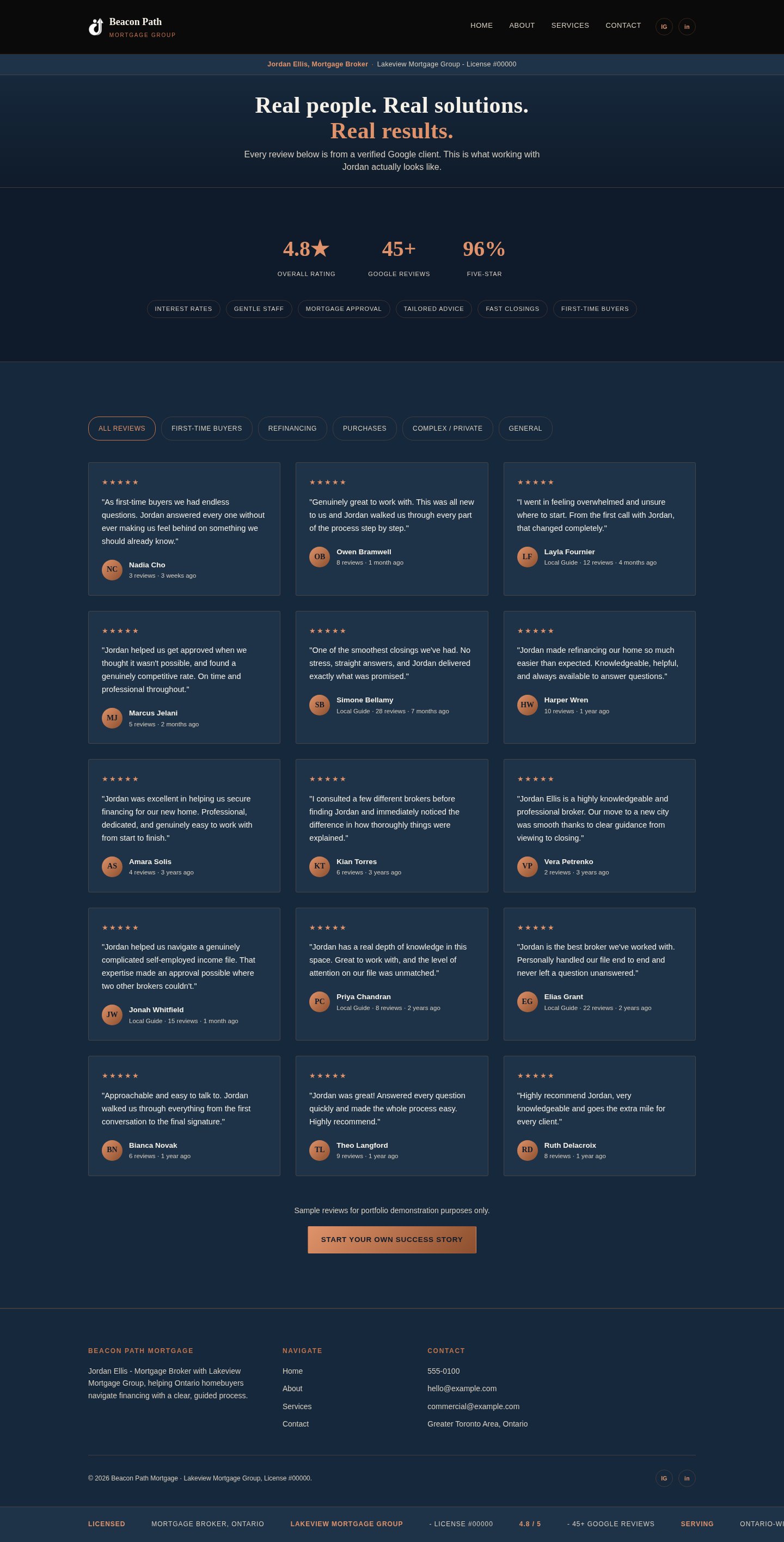
Real, full-page captures of the finished React build, rendered at desktop and mobile widths.
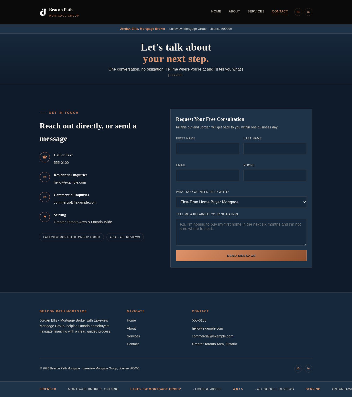





What shipped
- Five fully responsive pages, built mobile-first, then rebuilt in React for long-term maintainability without losing any fix made along the way.
- A persistent, styled compliance bar carrying Jordan's name, license number, and brokerage on every page, functioning as a trust signal rather than legal fine print.
- A single dominant call to action per page, with a secondary low-commitment option (call or text) beside every primary form-based CTA.
- Eighteen testimonials, each written around a specific first-time-buyer concern rather than generic praise.
- A token-based design system, color, type, spacing, all defined as CSS custom properties, making future brand or content changes fast and low-risk.
If this were fully live and connected today
Beacon Path Mortgage is a concept project and has never run ads or taken real leads, so there is no live traffic to report. The numbers below model what would happen if this operated as a real independent brokerage, grounded in published industry benchmarks, not a claim of measured results.
| Scenario | Typical conversion rate | Source |
|---|---|---|
| Outdated or generic small-business site | 1% – 3% | Logos Web Designs, 2026 |
| Modern, well-built local-service site | 4% – 5% | Logos Web Designs, 2026 |
| Real estate / mortgage landing page, cold traffic | 2.6% median | First Page Sage, 2026 |
| Specialized mortgage lead-gen funnel | 5% – 12% | Leadpops |
| Beacon Path, projected (cold search traffic, first-time-buyer persona) | 2.5% – 5% | Modeled estimate |
Predicted visitor-to-inquiry rate in the first 90 days if this were live with a connected CRM. First-time buyers typically arrive cold through search rather than warm through referral, so this sits closer to the general real-estate landing-page benchmark of 2.6% median for cold traffic, with upside from a single clear CTA and plain-language content built specifically for this audience.
Sources: Logos Web Designs, small business conversion benchmarks (2026), First Page Sage, Leadpops, mortgage website conversion data.
How the project actually ran
1. Discovery
Regulatory research, first-time-buyer persona work, and one clear job assigned to each page.
2. Static build first
Mobile-first HTML/CSS/JS, iterated against the persona's specific anxieties before any framework commitment.
3. Compliance as trust signal
Turned the required disclosure bar into a genuinely persuasive element, styled and placed consistently on every page.
4. React rebuild
Ported every fix from the static version, then extended it: responsive nav, testimonial filtering, and a portrait-led About page.
5. Content and testimonials
Eighteen testimonials written around specific first-time-buyer concerns, not generic five-star praise.
6. Design system documentation
Every color, font, and spacing value tokenized as a CSS custom property, documented for future reuse.
7. QA and packaging
Linted, rebuilt, and verified with no backend and no exposed keys before calling it final.
What built it
What this project actually exercised
- Turning a regulatory requirement into a persuasive design element
- Responsive, mobile-first CSS build practices
- Token-based design systems built for long-term maintainability
- Content strategy written for an anxious, first-time audience, not a generic reader
- Full front-end build and later migration to React without regressing prior fixes
- Systematic QA discipline: linting, clean builds, and cross-device screenshot verification
What's next if this becomes a real engagement
- Connect the contact form directly into a CRM (HubSpot or similar) with a working New Lead → Closed pipeline.
- Add a plain-language mortgage calculator built for first-time-buyer education, not a generic rate widget.
- Launch on a real domain and replace this modeled conversion prediction with real analytics.
- A/B test the hero framing against alternative first-time-buyer hooks once there's real traffic to test against.
- Run a full accessibility audit (contrast, focus states, screen-reader labels) before any public launch.
- Adapt the brand and content to a real broker's actual license, photo, and business details if this becomes a client engagement.
What I'd take into the next project
The hardest part of this project wasn't the visual design, it was resisting the urge to write generic "trusted mortgage broker" copy. Every sentence had to survive one test: would this actually help someone who has never done this before feel less lost, or does it just sound reassuring without saying anything.
What I'm most proud of is the token-based design system underneath it. Every color and font choice lives as a CSS custom property, not a hardcoded value, which means the entire brand could be re-themed in an afternoon if the direction ever needed to change, without touching the underlying structure.
If I built this again, I'd bring in a real first-time buyer for a quick usability read before finalizing the Services page copy, since that's the section most dependent on getting plain language exactly right, and the one place a design decision made alone is easiest to get subtly wrong.
- Shyine Makin